How to Choose a Link in Bio Template That Actually Gets Taps
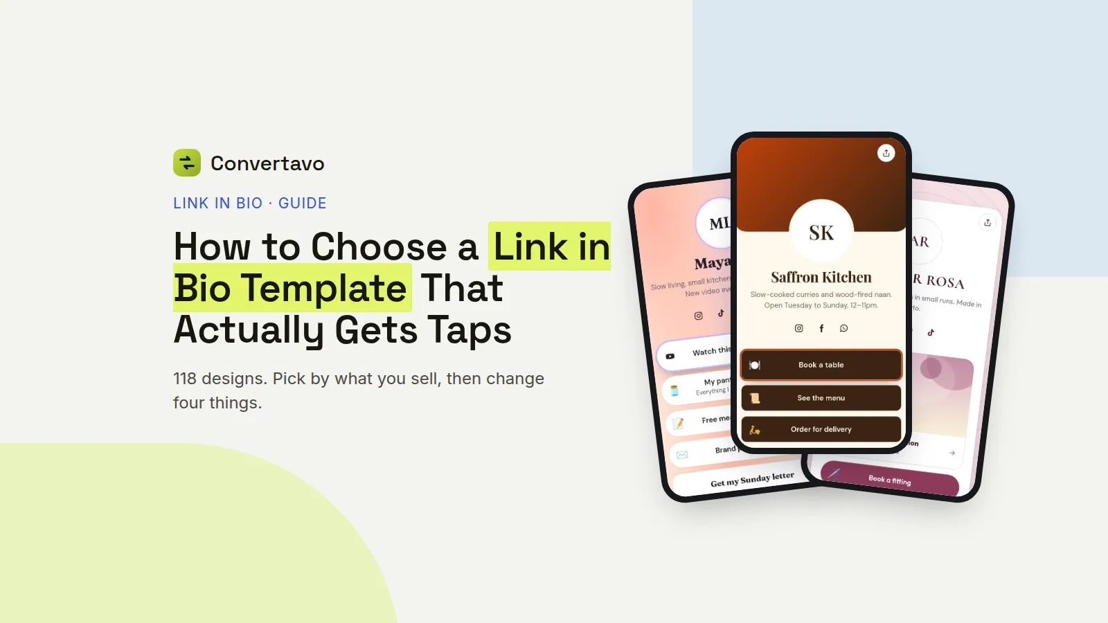
118 templates is a lot to scroll. Pick by what you sell, not by what looks nice, then change these four things.
 Noman Mustafa Owner
- Published
- Reading time9 min
On this page 22 sections
You open the gallery to choose a link in bio template, see 118 designs, and scroll for ten minutes without picking one.
Pick by what you sell, not by what looks nice. A restaurant needs a menu button and a map. A musician needs the new track playing on the page. Those are different starting points, not different colours.
Here is how to narrow 118 down to three in about a minute, and what to change once you have chosen.
How to pick one in about a minute
Six steps. The first two do most of the work.
Open the gallery and tap your category. Go to the 118 templates and pick the one that matches your work, like Creator, Small Business, Restaurants, Music, Fitness, Fashion, Education, Events, Gaming or Real Estate. That alone cuts the list to a handful.
Preview three, in Phone view. Every template has a live preview with a Phone and a Desktop switch. Use Phone, because that is where your visitors are. Ignore anything you would not tap yourself.
Press Use this template. Your page is built from it straight away, with sample blocks in place to show you the shape.
Claim your address. Type the name that goes after /@, like your shop name or your handle, and you see at once if it is free. Choose carefully, because this one cannot be changed later.
Swap the sample blocks for your real ones. Add your buttons, a video, products, a booking calendar, a map or a sign-up form, then drag them into order. The phone beside the editor updates as you type.
Copy your address into your bio. Paste it into Instagram, TikTok, X or anywhere else. From then on you change the page, never the bio.
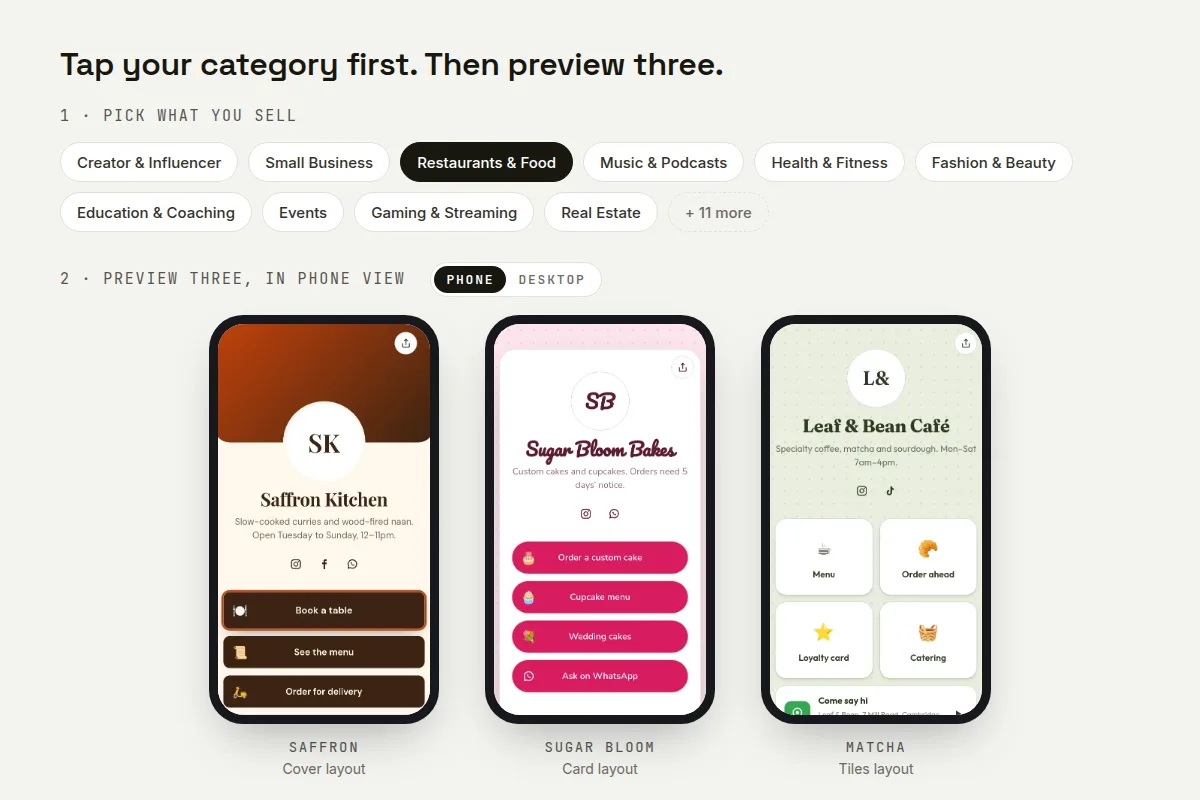
Tap your category, then compare three designs in Phone view.
Do not spend an hour trying to choose the perfect link in bio template. A finished page with four good buttons beats a perfect design you never published.
Which category fits you, and what belongs on it
These ten categories cover most people. Find your row, then open that category and pick from the designs inside it.
Category | If you are | Blocks worth having | Put first |
|---|---|---|---|
Creator and Influencer | On YouTube, TikTok or a podcast | Video embed, social icons, sign-up form | Your newest video |
Small Business | A shop, a service or a home business | WhatsApp button, products, map, contact form | Order on WhatsApp |
Restaurants and Food | A cafe, bakery or home kitchen | Menu, map, booking, products | This week's menu |
Music and Podcasts | An artist, DJ or podcaster | Spotify or Apple Music embed, dates, merch | The new track, playing |
Health and Fitness | A trainer, gym or nutritionist | Booking calendar, plans, sign-up form | Book a session |
Fashion and Beauty | A boutique, salon or reseller | Gallery, products, booking | Shop the new drop |
Education and Coaching | A tutor, coach or course seller | Booking, course buttons, countdown, form | Book a free call |
Events | Running a gig, workshop or meet-up | Countdown, tickets, map, schedule | Get tickets |
Gaming and Streaming | A streamer | Live link, socials, merch | Watch live |
Real Estate | An agent or landlord | Listings, booking, map, contact card | See current listings |
Two rows people get wrong.
Small Business is the right category for most home businesses, not Creator, even if you post like a creator. Your visitors came to buy, not to browse.
Restaurants and Food suits anyone selling food from home, including cake and tiffin businesses. The designs there already put a menu and a map near the top, which is exactly what those visitors want.
The layout matters more than the colours
Every template is built on a layout, and the layout decides how much fits on the first screen. There are 8 to choose from, and these are the ones you will meet most.
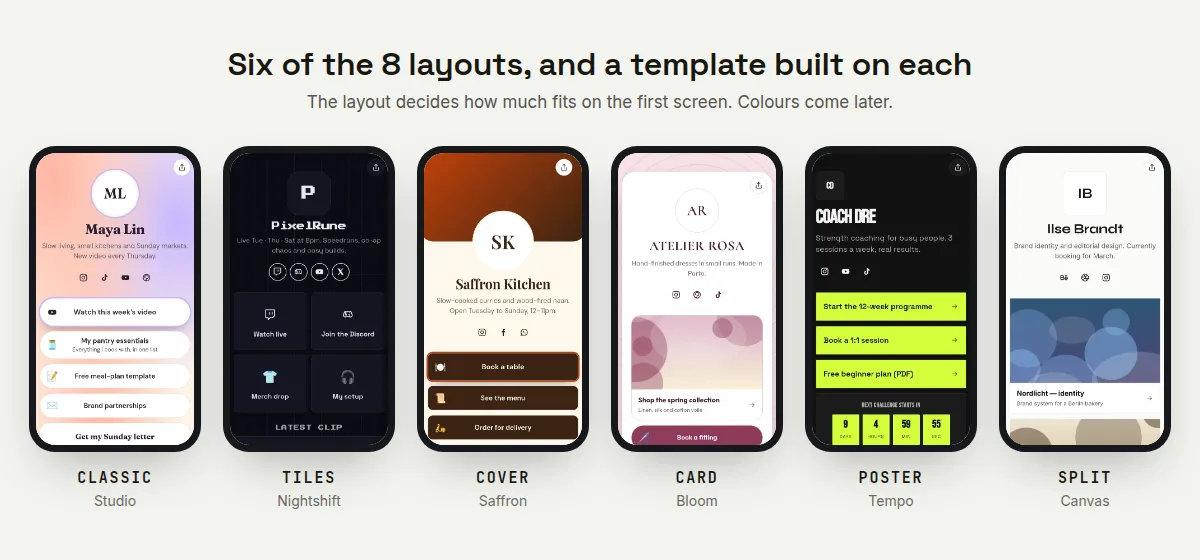
Six of the 8 layouts, each on a template built with it.
Classic
A photo, your name, a line about you, then buttons down the page. It is the safest choice and the easiest to read. Studio, Glow and Aurora are built this way.
Use it when your buttons are the point and nothing needs to be shown off.
Tiles
Buttons sit in a grid, two across. More fits on the first screen, which suits a page with six or more things on it. Nightshift and Matcha use it.
The catch is that tiles give each button less room, so short labels only.
Cover
A full width photo at the top, with your buttons below it. Saffron and Vinyl do this. It looks the best of any layout when your photo is good.
It also pushes your first button further down, so use it when the picture is doing real work, like food or an album cover.
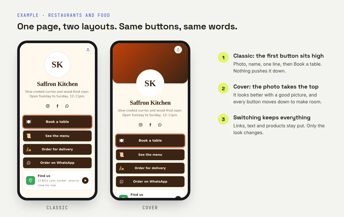
Same page, same buttons. The Cover photo moves every button down.
Card
Everything sits in a panel floating on a background. Bloom is the example. It reads as tidy and a little formal, which suits coaching, property and professional services.
Poster
Big type, one strong message, few buttons. Tempo is the one. It is made for a single campaign, a release or an event, and it is a poor fit for a page with ten links.
Split
The screen divides between an image and your content, so both get space. Canvas and Pilot use it. It works well on a desktop and needs checking on a small phone.
If you cannot decide, start with Classic. It is the hardest layout to get wrong, and you can switch later without losing anything.
Are the templates free, and is the page safe?
Every template is free, and so is every feature attached to them. There are no ads on your page.
What does free include?
All 118 templates, the 8 layouts, 24 fonts, 12 patterns and your own colours. Also the 24 kinds of block, scheduling, products, forms, insights, password protection and the option to hide the Convertavo line at the bottom.
Many bio link services keep templates, analytics or branding removal for paid plans. Here none of that is held back, and there is no limit on how often you edit.
Why do I need an account?
So the page stays yours on any device, and so your click data and sign-ups have somewhere to live. It is free and needs no card.
What are the limits?
Up to 50 buttons and products per page, one email sign-up, and up to 10 pages per account. Your address is 3 to 30 characters and cannot be changed once the page exists.
How are visitors counted?
Without cookies. Bots are left out and IP addresses are never stored. You still see views, unique visitors, click-through rate per button, and the sources, countries and devices people came from, for up to 12 months.
Is anything checked?
Yes. Every button gets the same safety checks as a short link, so nobody can hide a scam behind a bio page. Pages that break the rules are removed.
The template is not permanent, so stop agonising
You can switch templates later and keep everything. Your links, text, videos and products stay exactly where they are. Only the look changes.
That is the thing nobody tells you, and it is why people spend an hour on a five minute decision. One competitor's blog compares picking a template to getting a tattoo. It is closer to changing a phone case.
The one choice you cannot undo is your address at /@. Everything else is a setting.
Change these four things, in this order
1. The first screen. What a visitor sees before scrolling decides nearly everything. It should answer who you are and what to tap, in one glance. If your main button sits below the fold on your own phone, move it up or change the layout.
2. The photo. A clear picture of you, your food or your product beats a logo at this size. Replace the template's sample image before anything else, because a stock photo on a bio page is spotted instantly.
3. The button labels. Write the action, not the noun. There is more on this in our guide to adding multiple links to your Instagram bio.
4. Colours and fonts. Last, and quickly. Pick one colour from your logo or your photos and leave the rest alone. Two fonts is plenty.
Use motion once, or not at all
Buttons can have a spotlight, a pulse, a wiggle or a shine. Pick one effect, on one button, usually the one you most want tapped.
Two moving buttons cancel each other out. And anyone who has turned animations off on their phone sees none of it, so the page has to work without the movement anyway.
Check it in two weeks, then decide
Your insights show the click-through rate of every button. If your top button is not winning, the problem is the first screen, not the colour.
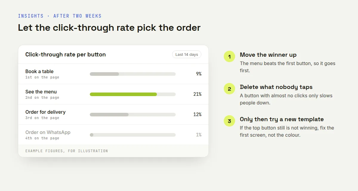
Example figures. Move the winner up and delete the button nobody taps.
Move the winner up, delete the one nobody touched, and only then think about trying a different template. Save a look you like and you can reuse it on your other pages.
Why is my page not getting taps?
Ten common cases. Most are the first screen, not the design.
What is happening | Why | What to do |
|---|---|---|
Lots of views, few clicks | Your main button sits below the first screen | Move it to the top, or switch to a Classic layout |
Nobody scrolls past the photo | A Cover layout with a big image pushes buttons down | Try Classic or Tiles instead |
Button labels look cramped | Tiles gives each button less room | Shorten the labels, or move off Tiles |
The page looks fine, no orders | The label says what it is, not what to do | Rewrite it as an action, like Order on WhatsApp |
Text is hard to read | A photo background behind small text | Use a pattern or a solid colour instead |
Everything moves at once | More than one animated button | Keep one effect, on one button |
It looks wrong on a phone | You designed it in Desktop view | Switch the preview to Phone and fix it there |
The page loads slowly for others | A large background photo | Use a smaller image, or a pattern |
No views at all | Your posts never mention the link | Add a line like menu in bio at the end of your bio |
Your page is not on Google | Search engines skip it by default | Tick the search engines box in Settings |
If you only change one thing, change the first screen. That is where the decision happens, and nothing further down the page can fix it.
Other free tools that help
QR Code Generator turns your page into a code for a poster, a menu card or a shop window.
URL Shortener is the simpler answer when you only have one thing to share.
Compress Image shrinks a heavy background photo so your page loads fast on a slow connection.
Pick three, then pick one
Open your category, preview three designs in Phone view, and choose the link in bio template you would tap yourself. Claim your address, swap the sample blocks for your real ones, and publish it today. Everything except the address can be changed later, so build your free link in bio page now and tidy the colours when you have click data to go on.
Frequently asked questions
Can I change my template later?
Yes, and your links and content stay exactly as they are. Only the look changes, so trying another design costs you nothing but a minute.
How many link in bio templates are there?
118, sorted into 21 categories like Creator, Small Business, Restaurants, Music and Events. You can also start from a blank page and build your own.
Which template should a small business pick?
Start in Small Business, not Creator. Those designs put an order button, products and a map near the top, which is what a buyer is looking for.
Are the templates really free?
Yes, all of them, along with the layouts, fonts, patterns, blocks and insights. There are no ads on your page and no paid tier for designs.
Can I design my own page instead?
Yes. Start blank, choose the layout, background, colours, fonts and buttons yourself, and save the result to reuse on other pages.
What can I never change?
Your address at /@yourname. Pick that one carefully, because the whole point is that the link in your bio never has to change again.
Try it on your own file
Free, no signup, and your file is deleted an hour later.
Noman Mustafa — Founder of Convertavo I build the file tools on this site. Fifteen years of writing software, and most of my days now go into making PDF, image and OCR processing fast enough to run in a browser tab. I write here about what I learn breaking files apart.